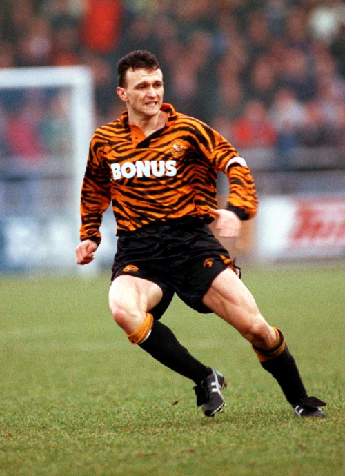
Hull City 1992 shirt
Their nickname might be The Tigers, but this kit was taking the name a bit too literal because in the 1992/93 season Hull City revealed their latest kit...a full tiger skin shirt...thankfully they've stayed away from this look ever since.
Norwich City 1992 shirt
Known by some as the "bird poo kit", this monstrosity of green splodges on the canary yellow background was actually a lucky charm for Norwich who finished 3rd in the newly formed Premiership and competed in Europe.

Mexico 1994 shirt
Goalkeepers always seem to get the short straw when it comes to shirts, but in the 1994 World Cup, Jorge Campos stunned us all when we donned this rather strange yellow, pink, purple and green psychedelic number.

Scunthorpe 1994 shirt
Whether it's the bright pink background, the strange sweet-like markings or the fact that it's sponsored by Pleasure Island, this kit from Scunthorpe was not their finest hour.

Bochum 1997 shirt
It looks like everyone had a say in the design when it came to cobbling this together; it looks like a mish mash of three different shirts, and what on Earth is the rainbow section all about?

Huddersfield Town 1993 shirt
If they'd left this shirt with the simple pinstripes then it would have been pretty smart, even the black sponsor in a vertical stripe isn't too bad, but when they added the strange bit to the left hand side they went a bit too far!

Athletic Bilbao 2004 shirt
This was their centenary shirt and so was supposed to be memorable...unfortunately, it was memorable for all the wrong reasons. They commissioned a local artist to come up with the design, I don't even know what it's supposed to be.

Colorado Caribous 1978 shirt
They only existed for one season in the NASL and it's no wonder why with this ridiculous shirt. Complete with tassels, this western-inspired kit actually makes some of the others in this blog look good.

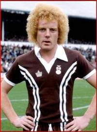
Coventry City 1978 shirt
It might have been fashionable back in the 70s and the actual design of the shirt isn't that bad...it's the awful brown colour that makes this shirt one of the worst of all time!
Aston Villa 1993 shirt
Who ever thought green and black stripes with a red outline looked good needs shooting! This horrific shirt certainly makes some of the others in this post look tame.


No comments:
Post a Comment